By August Benzow
The majority of new COVID-19 deaths are in cities, but rural areas are still struggling.
Key Findings
- As of early January, all regions of the country are experiencing a higher number of new weekly COVID-19 deaths compared to the beginning of November, and only the Midwest is seeing a sustained downward trajectory.
- Deaths are surging in urban counties, but when adjusted for population, deaths are still disproportionately higher in rural counties.
- Five of the country’s 10 largest counties experienced their highest increase in COVID-19 deaths in December compared to any other previous month of the pandemic: Maricopa, Los Angeles, Riverside, San Diego, and Dallas.
- New COVID-19 deaths in December were 272.2 percent higher compared to October in counties that went to Biden, and 204 percent higher in counties that went to Trump.
- The 10 percent of counties that were the most economically distressed before the pandemic have an average COVID-19 death rate 2.1 times higher than the 10 percent of counties that were the most economically well-off.
- COVID-19 deaths among white Americans have risen at a faster rate than any other group since September, with cumulative deaths for white people almost identical to their share of the population as of the second week of January.
- However, the average COVID-19 mortality rate for a distressed county with a higher than average share of Hispanics is 210.9 deaths per 100,000, 201.2 for those with an elevated Black share, and 145.5 for those with an elevated white share.
- In Michigan, Black people make up 26.1 percent of COVID-19 deaths, while making up just 13.7 percent of the population. Similarly, in Texas, Hispanics make up 50.1 percent of the state’s COVID-19 deaths while representing 39.2 percent of its population.
Introduction
Three months ago, EIG published an analysis of COVID-19 deaths that found that rural areas had nearly eclipsed urban areas in the share of new deaths from the virus, and that the virus was spreading rapidly through Trump country and majority Black counties in the Deep South. While these trends continue to define the map of COVID-19 mortality, America’s largest urban areas have once more become the epicenter of new deaths from the virus. As cases and deaths surge once more in these urban areas, communities of color and areas of high economic distress continue to suffer disproportionately from the unchecked spread of the virus.
Methodology
This analysis combines county-level data on demographics and local economic well-being from EIG’s Distressed Communities Index with data on the pandemic from the COVID Tracking Project, published through Social Explorer. This dataset is updated daily, but given that reporting patterns vary throughout the week, this analysis relies on weekly snapshots through each Monday beginning with March 2nd, 2020, and ending with January 18th, 2021. Additional data was included from CDC datasets to analyze mortality by race and ethnicity.
Economic distress at the county level is determined using EIG’s Distressed Communities Index (DCI), which ranks each county by its relative economic performance on seven key metrics. The DCI divides U.S. counties into five even buckets: prosperous, comfortable, mid-tier, at risk, and distressed. The overwhelming majority of counties that are classified as distressed with this approach are rural, because these low-population areas are often areas where a high share of the population experience economic distress, whereas most metro counties are a mix of distress and prosperity.
Since this analysis is primarily concerned with how higher rates of COVID-19 mortality map onto existing spatial, economic, and racial inequalities, it exclusively focuses on deaths from COVID-19 and not cases. Because deaths are a lagging indicator, not all trends currently reflected in case data are also reflected in death data. In some instances, the data is reported from multiple counties as a single county. For instance, there is a single value for New York City, consisting of data for New York, Kings, Queens, Bronx, and Richmond Counties.
The expanding geography of COVID-19
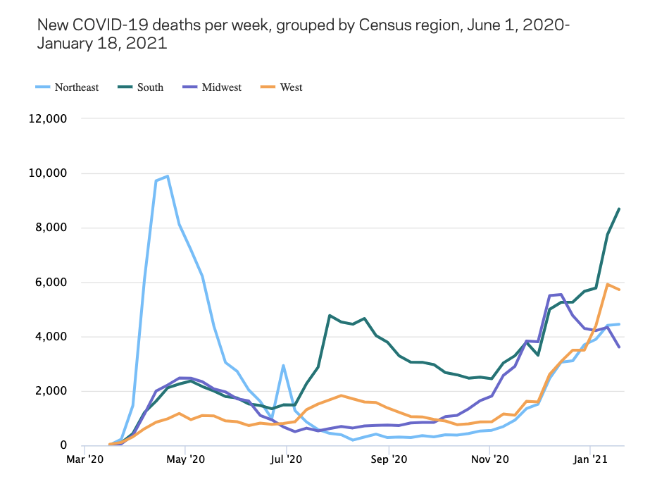
Since the start of the COVID-19 pandemic, a pattern has emerged where deaths spike in one region of the country, and then temporarily subside as they spike in another region. In the spring, deaths skyrocketed in the Northeast, with New York City as the clear epicenter. Over the summer, deaths climbed rapidly in the West and the South, while leveling off in the Midwest and the Northeast. The Northeast maintained a comparatively low rate of new deaths through the fall, while the Midwest began to steeply climb again in early November. Around Thanksgiving, both the Northeast and the West began experiencing new surges in deaths after relatively low rates throughout the fall. As of early January, all regions of the country were experiencing greater numbers of new weekly COVID-19 deaths than in early November, and only the Midwest has recently experienced a sustained downward trajectory. The most new deaths from COVID-19 are now occurring in the populous South, which, with 8,685 deaths in the week to January 18th, is close to reaching the height of 9,888 deaths in a week registered in the Northeast in the spring. However, when adjusted for population, total deaths so far are more elevated in the Northeast and the Midwest.
At the end of October, deaths from COVID-19 in rural counties were rising slowly in lockstep with those in urban counties, but in the ensuing months urban counties have broken away as deaths have surged post-Thanksgiving in most of the country’s largest counties. Urban counties have 4.7 times the population of rural counties, so if deaths were proportional based on population, a significantly higher number of deaths would occur in urban counties versus rural counties. Until the end of July 2020, deaths in urban counties were more than 5 times as high as those in rural counties. By the end of October, deaths in urban counties were only 1.9 times higher than rural counties, reflecting the pandemic’s disproportionate impact on rural areas. By the middle of January, that ratio had expanded to 3.4 times, a significant increase, but still below what would be expected based on population distribution.
So far, over the course of the pandemic, urban counties have tended to experience surges of COVID-19 deaths followed by notable decreases, as strict public health measures and changes in individual behavior take effect. Rural counties, by contrast, have experienced a much more persistent increase since the middle of last summer. In June, there were 2,400 new deaths in rural counties, which increased to 5,600 in September before rising to 19,100 in December. By contrast, new deaths in urban counties dropped from 20,400 in June to 17,200 in September, before surging to 54,400 in December.
Half of the country’s 10 largest counties experienced their highest increase in COVID-19 deaths in December compared to any other previous month of the pandemic: Maricopa, Los Angeles, Riverside, San Diego, and Dallas. Just these five counties accounted for 12.1 percent of new COVID-19 deaths so far in January, even though they only account for 7 percent of the country’s population. Fifty-three percent of all counties recorded their highest number of deaths so far in the pandemic last month. California, Texas, and Pennsylvania had the highest number of new deaths in December, while Hawaii, Vermont, and Alaska had the fewest. Georgia, Montana, and the Dakotas were the only states with fewer deaths in December compared to the previous month.
Prior to the election, weekly increases in COVID-19 deaths were surging in Trump country, with Trump counties accounting for 61.2 percent of new deaths in the week ending on November 2nd. By the end of that month, this trend had begun to sharply reverse. As of the first week of January, counties that went to Biden began to make up the majority of new deaths again, and in the week ending on January 18th, 52.7 percent of new deaths were in counties that went to Biden. As with the urban-rural divide, this shift is not due to improving circumstances for Trump counties, but rather worsening conditions for Biden counties. New COVID-19 deaths in December were 272.2 percent higher compared to October in counties that went to Biden, and 204 percent higher in counties that went to Trump. However, the average per capita mortality rate for Trump counties is 137.7 deaths per 100,000 compared to 118.3 deaths per 100,000 for Biden counties.
Current COVID-19 death rates broken out across DCI deciles shows just how different the experience of the pandemic is for the most economically-disadvantaged counties. The 10 percent of counties that are the worst off economically have an average COVID-19 death rate 2.1 times higher than the 10 percent of counties that are the most economically well-off.
Deaths are now rising fastest among white Americans, but communities of color suffer compounded disadvantages
At the end of last summer, Hispanics and Black Americans were far more likely to die from COVID-19 than white Americans. According to data through the second week of last September, Black people made up 21.3 percent of those who had died from the virus since the start of the pandemic and Hispanics made up 20.9 percent, even though those groups represent 12.4 percent and 18.4 percent, respectively, of the country’s population. In the ensuing months, deaths among white Americans have risen at a faster rate than any other group, with cumulative deaths for white people almost identical to their share of the population as of the second week of January. The Hispanic share of COVID-19 deaths has fallen slightly below their population share while that number for Black Americans is still above their population share. It is also important to note that older people are more likely to die from COVID-19, and the median age for whites is significantly higher than Blacks or Hispanics (43.7 versus 34.8 and 29.8).
Even as white people are increasingly likely to die from the virus, there remain compounded disadvantages for Blacks and Hispanics. In counties that are economically at risk or distressed, and have an above average share of Blacks and Hispanics, COVID-19 mortality rates are much higher than in similarly situated counties disproportionately white. The average COVID-19 mortality rate for a distressed county with an elevated share of Hispanics is 210.9 deaths per 100,000, 201.2 for those with an elevated Black share, and 145.5 for those with an elevated white share.
Blacks and Hispanics are confronted with the simultaneous challenge of being more likely to live in an economically struggling community (56 percent of Black Americans live in a distressed or at risk community, as do 45 percent of Hispanics), and an elevated threat from COVID-19. Imperial County, California is 83.8 percent Hispanic, and nearly a quarter of the population live below the poverty line. 14.0 percent of its residents have been infected with COVD-19 and its per capita mortality rate is 256.4. Shelby County, Tennessee (Memphis), is 53.3 percent Black and 46.4 percent of the county’s population live in a distressed zip code. 1,140 people have died from COVID-19 in the county, nearly double that of the more populous and much whiter Salt Lake County, Utah, which has no distressed zip codes.
COVID-19 deaths by race or ethnicity, available at the state level, show just how stark these disparities can be. In Michigan, where 57.3 percent of the state’s Black population live in an economically distressed zip code, Black people made up 26.1 percent of COVID-19 deaths as of January 13th, while making up just 13.7 percent of the population. Similarly, in Texas, where 32.4 percent of the state’s Hispanic population live in a distressed zip code, Hispanics made up 50.1 percent of the state’s COVID-19 deaths while representing 39.2 percent of its population.
Conclusion
A year ago, on January 20th, 2020, the first confirmed case of COVID-19 in the United States was detected. As the country rapidly approaches the grim milestone of a half million dead from the virus, it is important to not lose sight of the map of inequality across which the virus has spread, because these inequalities will not disappear when the virus is finally brought under control. Future policy efforts will need to directly address the disparities that have made so many communities across the country especially vulnerable to the virus.
1 Rural is defined here as more than 50 percent of a county’s population living in a rural area, while urban has more than 50 percent of a county’s population living in an urban area.