By August Benzow
Key Findings
- In the first few months of the pandemic, counties in the Northeast led the nation in total mortality, but by the second week of October, the total number of deaths in Southern counties had surpassed the total number of deaths in Northeastern counties.
- Out of the 1,128 counties with a per capita death rate above the national average, 64.4 percent are in the South, 23.4 percent in the Midwest, 6.5 percent in the Northeast, and just 5.8 percent in the West.
- In the fourth week of October, deaths in rural and small town counties accounted for 46.4 percent of new COVID-19 deaths, compared to 53.6 percent of new deaths from urban/suburban counties. If this trend of accelerating convergence continues, the majority of new deaths will be in rural and small town counties within the next couple weeks—if not days.
- The spread of COVID-19 into rural America has also pushed it deeper into Trump country. By the last week of October, Trump counties contributed nearly two thirds (60.6 percent) of new COVID-19 deaths.
- By the fourth week of October, the average cumulative death rate per capita in an economically distressed county was more than double that of the average prosperous county.
- The ten percent of counties that are the worst off economically have an average COVID-19 death rate 2.5 times higher than the 10 percent of counties that are the most economically well-off.
- Distressed counties with an above average white share had an average COVID-19 death rate of 54.0 deaths per 100,000. This number more than doubles for counties with an above average Black share, where it averages out to 128.0 per capita deaths.
- In NYC, where there is data for COVID-19 deaths broken out by race, Black residents were 1.6 times more likely to die from COVID-19 than white residents, and Hispanics 1.3 times.
Introduction
EIG’s recently published Distressed Communities Index exposed how deeply unequal American communities remain even after a decade of robust national growth. This persistent inequality has shaped the path of the COVID-19 virus across the country’s disparate geographies and has become a determining factor in who lives and who dies as different communities face different outcomes. Black and brown communities that were at the greatest disadvantage in the early days of the pandemic, as the virus primarily targeted urban areas, have continued to suffer higher mortality rates as rural areas now make up a rising share of deaths from COVID-19. The similarities between the map of distressed communities and the map of elevated rates of death from COVID-19 show that economic distress is an underlying cause of poor health outcomes and inadequate access to the care needed to successfully combat the virus.
Methodology
This analysis combines county-level data on demographics and local economic well-being from EIG’s Distressed Communities Index with data on the pandemic from the COVID Tracking Project, published through Social Explorer. This dataset is updated daily with the data for any given day typically available within twenty-four hours. For the purposes of this analysis, a weekly snapshot is used that includes data from the Monday of each week, beginning with March 2nd, 2020, and ending with October 26th, 2020.
Economic distress at the county level is calculated by ranking each county by its relative economic distress on seven key metrics. This divides U.S. counties into five even buckets: prosperous, comfortable, mid-tier, at risk, and distressed. The overwhelming majority of counties that are classified as distressed with this approach are rural, because these low-population areas are often areas of concentrated disadvantage. Large, urban/suburban counties tend to have a mix of prosperous and distressed communities, which means that on balance they are seldom ranked as distressed.
Since this analysis is primarily concerned with how higher rates of COVID-19 mortality map onto existing spatial, economic, and racial inequalities, it exclusively focuses on deaths from COVID-19 and not cases. Because deaths are a lagging indicator, not all trends currently reflected in case data are also reflected in death data. In some instances, the data is reported from multiple counties as a single county. For instance, there is a single value for New York City, consisting of data for New York, Kings, Queens, Bronx, and Richmond Counties.
The evolving geography of COVID-19
Over the summer, the rural South overtook the urban Northeast as ground-zero for the pandemic, and now the virus continues to spread deeper into rural America. For the first few months of the pandemic, counties in the Northeast led the nation in total mortality, as the virus spread through densely populated areas, predominantly those close to New York City. When deaths in Northeastern counties hit 70,000 in August, less than half (43.6 percent) of Northeastern counties had a cumulative per capita death rate above the national average, reflecting how the pandemic’s worst toll in the region was concentrated in a minority of its counties. Around that same time in late summer, deaths began to surge in the South, and by the second week of October, the total number of deaths in Southern counties had surpassed the total number of deaths in Northeastern counties. Unlike the Northeast, the virus was much more widespread in the South as it hit sparsely populated rural counties the hardest. When the South reached 70,000 deaths at the beginning of October, more than half (52.3 percent) of Southern counties had a per capita death rate1 above the national average. And there are early signs that this geography is shifting again. The highest average week-over-week change in cumulative COVID-19 deaths was in Midwestern counties at the end of October: 4.6 percent, compared to 3.3 percent in Southern counties, 2.7 in Western counties, and just 0.7 percent in Northeastern counties.
The contribution of rural and small town counties to the share of weekly COVID-19 deaths has steadily increased since March even though 80.9 percent of deaths so far have been in urban/suburban counties. In the fourth week of October, deaths in rural and small town counties accounted for 46.4 percent of new COVID-19 deaths, compared to 53.6 percent of new deaths from urban/suburban counties. If this trend of accelerating convergence continues, the majority of new deaths will be in rural and small town counties within the next couple weeks—if not days.
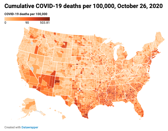
Counties with a cumulative per capita COVID-19 death rate above the national average are concentrated in the southern United States and in areas of the Northeast close to New York City, even though these “hotspots” can be seen in almost every state. Out of the 1,128 counties with a per capita death rate above the national average, 64.4 percent are in the South, 23.4 percent in the Midwest, 6.5 percent in the Northeast and just 5.8 percent in the West. This represents a worsening trend for the South. At the beginning of May, its counties made up 52.5 percent of all U.S. counties with an elevated cumulative per capita COVID-19 death rate. In the South, 86.6 percent of the counties with a COVID-19 death rate above the national average are small town/rural, whereas in the Northeast 74.0 percent are urban/suburban. Much like the South, 86.4 percent of counties in the Midwest with elevated COVID-19 death rates are small town/rural, while in the West that share is somewhat smaller at 75.4 percent.
The political consequences of COVID-19’s changing map
The spread of COVID-19 into rural America has also pushed it deeper into Trump country. Until the second week of August, counties that went to Clinton in the 2016 election accounted for the most new weekly deaths from COVID-19. Through September, new deaths were split nearly evenly between the two groups of counties before Trump counties began to trend upward in their number of new deaths at the beginning of October. By the last week of October, Trump counties contributed nearly two thirds (60.6 percent) of new COVID-19 deaths.
Spreading in areas of concentrated distress
The rural areas where the pandemic is spreading and mortality is rising generally entered the fight from positions of disadvantage. Rural counties in general are much more likely to be economically distressed. 48.2 percent of rural counties are distressed or at risk while just 30.8 percent are prosperous or comfortable. These distressed rural areas confront this new health crisis already at a debilitating disadvantage.
A previous study published by EIG found that residents of distressed rural zip codes contend with half as many hospital beds per capita within a 20-mile radius as their peers in prosperous rural areas. Pre-pandemic, distressed counties contended with a premature age-adjusted mortality rate 1.8 times higher than prosperous counties, and 13.2 percent of residents lacked health insurance (compared to 7.4 percent in prosperous counties). Social Explorer combines risk factors like a lack of health insurance with other metrics, such as physical crowding and rates of respiratory disease, to quantify community resilience and identify areas with high risk populations.2 Nearly a third of residents in distressed communities are considered high risk individuals compared to a little over a fifth of residents in prosperous communities.
As the pandemic began to take root and spread across the country, moving beyond the nation’s coastal hubs, the per capita COVID-19 death rate in distressed counties surged, and beginning in early June, broke away from the trend line of prosperous counties. By the fourth week of October, the average cumulative death rate per capita in a distressed county was more than double that of the average prosperous county — 84.5 COVID-19 deaths per 100,000 in the average distressed county, compared to 39.9 in the average prosperous one. This eclipses the average for counties in the next tier above distressed, at risk, which averaged 59.5 cumulative COVID-19 deaths per 100,000 in the same time period.
Current COVID-19 death rates broken out across DCI deciles shows just how different the experience of the pandemic is for the most economically-disadvantaged counties. The ten percent of counties that are the worst off economically have an average COVID-19 death rate 2.5 times higher than the 10 percent of counties that are the most economically well-off. As a group, the bottom forty percent of counties experience rising COVID-19 death rates as their economic distress rises.
Communities of color are at greater risk
Even as the pandemic has moved from one hotspot to the next, a notable constant is the disproportionate impact on communities of color. According to CDC data tracking COVID-19 deaths from May to August 2020, 51.3 percent of those who died were non-Hispanic white, 24.2 percent were Hispanic, and 18.7 percent were Black. These numbers are misaligned with the population composition of the country as a whole where 60 percent of the population is non-Hispanic white, 18.4 percent Hispanic and 12.4 percent Black. Data on Native Americans is more limited, but the most comprehensive CDC estimate concludes that the case-rate for Native Americans is 3.5 times higher than for non-Hispanic whites, although the actual number may be even higher.
In the first few months of the pandemic New York City came to represent the immense struggle and sacrifice necessary to bring the spread of COVID-19 under control. It is also a microcosm, which shows how deep stratification along lines of race and economic well-being can determine who is most likely to die from exposure to the virus. Because New York City provides race and ethnicity data for the COVID-19 deaths across its five boroughs, it is possible to see how disparate the impact of the pandemic is between minorities and non-Hispanic white Americans. As of mid-October, Black residents’ share of total COVID-19 deaths in each borough of New York City, exceeded their share of the borough’s total population. For example, in Brooklyn, Blacks make up 29.8 percent of the borough’s population, but accounted for 40.6 percent of deaths in the borough. Hispanics did not fare much better in most boroughs. In Manhattan, where 25.6 percent of residents are Hispanic, 40 percent of individuals who died from COVID-19 were Hispanic. By contrast, whites make up 46.9 percent of Manhattan’s population, but only accounted for 28.4 percent of deaths in the borough. Put another way, Black residents of NYC were 1.6 times more likely to die from COVID-19 than white residents, and Hispanics 1.3 times.
This trend is almost certain to worsen as COVID-19 deaths rise in counties outside of major metro areas. In the South, small town and rural counties with an above average per capita COVID-19 death rate have a 23.5 percent average Black share of the population. In the West, rural and small town counties with an above average per capita COVID-19 death rate are 20.1 percent Hispanic and 14.3 percent Native American on average.
As shown above, distressed and at risk counties have higher cumulative per capita COVID-19 death rates than prosperous and comfortable counties. For counties with an above average share of Blacks and Hispanics, the trend is even worse across quintiles. In comfortable counties, which had the lowest average per capita death rate, counties with a white share above the average of all comfortable counties had an average COVID-19 death rate of just 32.6 deaths per 100,000 people. That number climbs to 51.4 for Hispanics and 55.1 for Black Americans. In distressed counties the gap is far wider. Counties with an above average white share for a distressed community had an average COVID-19 death rate of 54.0 deaths per 100,000. This number more than doubles for counties with an above average Black share, where it averages out to 128.0 per capita deaths. Thus, Black and brown areas are likely to experience significantly higher COVID-19 mortality rates than white areas in similar economic circumstances.
The country’s non-white populations were already at a severe disadvantage before the pandemic. In the average county, 8.2 percent of non-Hispanic whites lack health insurance, compared to 12.5 percent of Blacks and 20.4 percent of Hispanics. Someone who is Black or Hispanic and lives in a prosperous county is less likely to have health insurance than someone who is white and lives in a distressed county. Structural inequities like this put these populations at greater risk in the current health and economic crisis.
Conclusion
While the COVID-19 pandemic initially spread aggressively through some of America’s most prosperous metro areas, it has over the past six months penetrated deeper into areas of concentrated economic distress. Rural counties that lack the resources to effectively combat the virus and which have especially high shares of vulnerable populations are experiencing surging COVID-19 death rates with no clear reprieve on the horizon. Communities of color that have suffered economically even during the last decade of growth, and which tend to have high shares of the population with underlying health conditions, are especially at risk. Relief efforts should target these areas of elevated distress before the health crisis worsens further. As the pandemic spreads to almost every part of the country, it seems inevitable that it is also on voter’s minds as they cast their ballots, and may warp the traditional red/blue political map.
1 To account for weekly adjustments to the data, the death rate is calculated using cumulative deaths for each county in a given week.
2 This aggregate metric identifies populations with risk levels that are low (0 risk factors), medium (1–2 risk factors) and high (3 or more risk factors). The following risk factors are used: age 65 and above; low-income household; single caregiver householder; household communication barrier; employment status; disability status; physical crowding; lack of health insurance; respiratory disease; heart disease; and diabetes.