These stories bring the Distressed Communities Index (DCI) to life and demonstrate how the index can be used to understand the challenges and opportunities that communities face across the United States. These stories are intended to both inform and inspire.
At its heart, the DCI is a tool for exploring the map of American well-being. The stories presented here highlight the many different geographies of economic inequality that traverse the country and explain why they matter, influencing every aspect of life, from the friends one makes to how long one can expect to live.
Economic inequality often divides neighboring communities
The DCI excels at revealing inequality at detailed geographic levels, often hidden when looking at broader state, metropolitan, or county data. Prosperous regions frequently contain neighboring communities with vastly different economic conditions, a phenomenon known as “spatial inequality.”
EIG quantified spatial inequality by analyzing economic well-being variations across zip codes in counties with at least 500,000 residents. They weighted each zip code’s distress score by population size, resulting in a numerical measure of inequality within county borders.
The Dallas-Fort Worth metro area exemplifies how county-level data can mask neighborhood-level disparities. At first glance, the metro area appears as a patchwork of thriving and stable counties, including those containing downtown areas. More apparent distress seems concentrated in outlying rural communities.
The Dallas-Fort Worth metro shows how inequality can be masked at the county level

Viewing the same area at the zip code level reveals a huge variation in economic well-being. The map is now dotted with pockets of distress concentrated in the urban cores and radiating out into communities south of Dallas and around Fort Worth.
Tarrant County’s overall prosperity masks stark divides under the surface

 Examining Tarrant County, Texas more closely reveals a different story. This county, which includes Fort Worth and has a population exceeding 2 million, ranks as prosperous overall. However, it also holds the distinction of having the ninth-highest spatial inequality nationwide. This striking disparity only becomes apparent when analyzing the DCI performance of individual communities within the county, highlighting the importance of granular data analysis.
Two neighboring zip codes share a border but have little else in common

 The 75209 zip code, adjacent to Dallas’ affluent University Park district, stands out as one of Texas’ wealthiest areas. This neighborhood, with a majority white population, is characterized by its desirable property market, low poverty rates, and high educational levels, as evidenced by 71 percent of inhabitants possessing a Bachelor’s degree or higher. The region has a comparatively small immigrant population, with only 11 percent of residents born outside the United States.
In sharp contrast, the neighboring zip code 75220 in north Dallas represents one of Texas’ most economically challenged areas. This community is characterized by its large immigrant population, with nearly half of its residents born outside the United States. It is a predominantly Hispanic area, with 70 percent of inhabitants identifying as such. When compared to its affluent neighbor, 75220 grapples with significant socioeconomic hurdles. Residents here experience substantially lower incomes, and a striking 41 percent of the adult population lacks a high school diploma.
Spatial inequality and segregation are deeply intertwined across the country

 These same dynamics play out within many large counties across the United States.
The nation’s most spatially unequal county is Shelby County, TN, home of Memphis. Here, prosperous suburbs contrast sharply with the economic distress closer to downtown.
Much of this geographic divide in well-being is tied to the racial makeup of communities and the history of residential segregation that continues to define maps of American life and well-being.
In Shelby County, the share of Black residents is significantly higher in distressed zip codes. Only zip code 38125—roughly approximating the suburban Richwood neighborhood and nearby communities—manages to break the barrier to prosperity facing most Black communities in the county.
Suburban counties tend to be more uniform with less obvious spatial inequality
 By contrast, the most uniformly prosperous large counties tend to be more suburban.
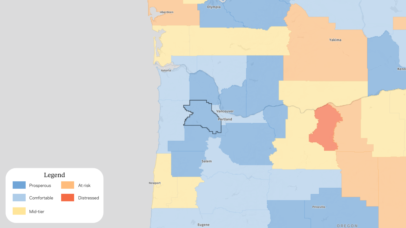
Take Washington County, OR, just outside Portland, for example. It contains the municipalities of Beaverton and Hillsboro (along with sprawling blue-chip corporate and technology campuses for Intel and Nike) and boasts the lowest level of spatial inequality in the country.
Washington County, Oregon, consists almost entirely of economically well-off communities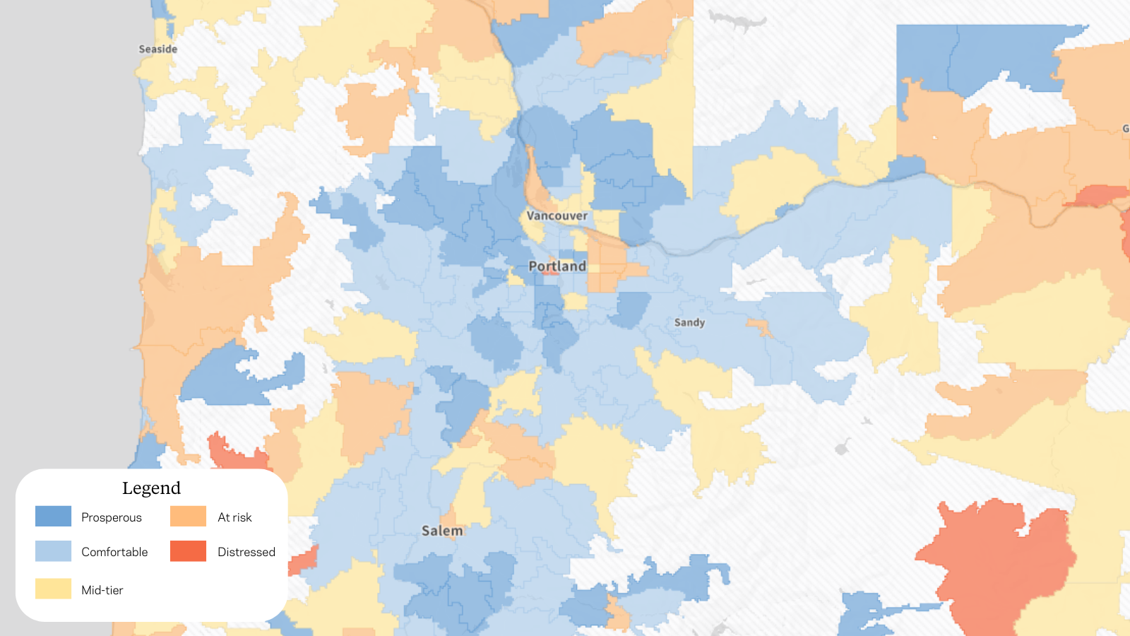
Nearly every zip code within Washington County’s borders scores as prosperous or comfortable.
Places with such low levels of spatial inequality tend to be relatively homogenous, where people at similar income levels cluster and recycle their local tax dollars back into schools, infrastructure, and other amenities.
Explore spatial inequality across the nation’s largest counties
The table below displays the spatial inequality rankings for counties of at least 500,000 residents.