Key Findings
- Hospital beds are disproportionately located in distressed communities, partially reflecting hospitals’ tendency to be in the central cities of metropolitan areas. As a result, most residents of distressed urban communities live in relatively close proximity to hospitals.
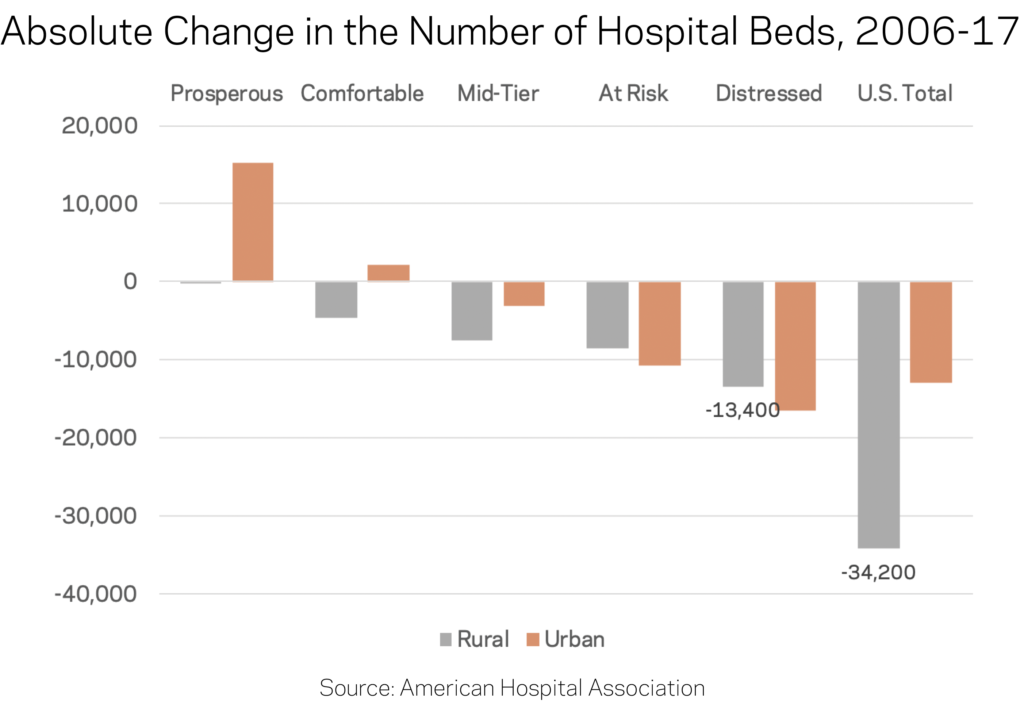
- The number of hospital beds is rising in prosperous zip codes and falling everywhere else. Amid a five percent decline nationwide between 2006 and 2017, distressed communities experienced the largest absolute and percentage drops in the count of hospital beds. Prosperous zip codes—generally the fastest-growing places in the country—were the only group in which bed counts increased.
- Declines in bed counts are most acutely felt in rural areas. Rural zip codes lost nearly one in five hospital beds between 2006 and 2017. Distressed rural zip codes lost the sheer greatest number.
- Residents of rural distressed zip codes have the worst hospital access. In urban areas, residents of distressed zip codes have reasonable access to twice as many hospital beds on a per capita basis as their better-off peers. Inversely, residents of distressed rural zip codes contend with half as many hospital beds per capita within a 20-mile radius as their peers in prosperous rural areas.
Introduction
The ability to quickly reach a hospital and receive care—especially in an emergency—is a vital part of anyone’s healthcare that can ultimately mean the difference between life and death. The U.S. healthcare system, particularly the hospital sector, is undergoing a transformation as it adapts to cost pressures from the insurance industry and changes to coverage unleashed by the Affordable Care Act that affect how people across the country access hospital services.
An emerging literature documents the link between health outcomes and local economic conditions. For example, we previously found that residents of the typical economically distressed county live nearly five years shorter than residents of the average prosperous county. Such divides show up across almost every indicator of health and well-being.
This brief aligns comprehensive data from the American Hospital Association (AHA) on the locations and sizes (defined by bed counts) of hospitals in the years 2006 and 2017 with zip code-level data on local economic well-being from our own Distressed Communities Index (DCI). The DCI ranks nearly 26,000 zip codes across seven different social and economic indicators before grouping them into quintiles of performance ranging from “prosperous” to “distressed.” The combined datasets allow us to examine how changes in the locations of hospitals and hospital beds relate to the underlying economic conditions of communities.
The changing geography of hospital beds
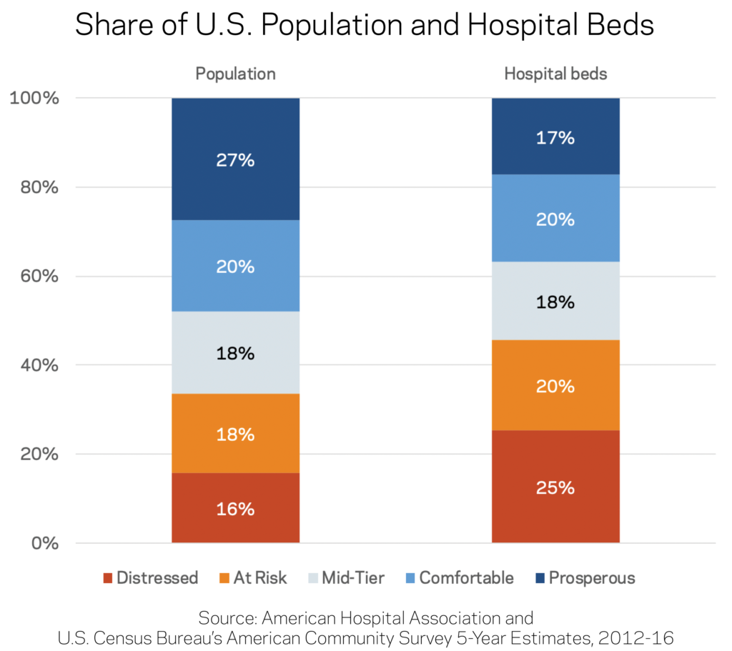
Hospital beds are disproportionately located in distressed communities. While just 16 percent of the U.S. population lives in a distressed community, more than a quarter of all hospital beds are located in these zip codes. Prosperous zip codes contain the most people but the fewest beds, while the remaining three middle tiers have roughly proportional distribution of both population and hospital beds.
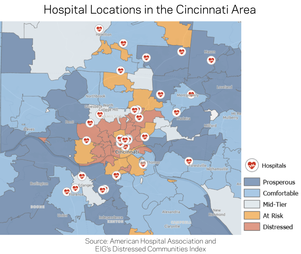
Part of this imbalance is likely due to the concentration of hospitals in the core of major cities, where neighborhoods are typically more distressed than the suburban commuter sheds they serve. For instance, the divide between the hospital locations with high bed counts in the distressed core of Cincinnati and the more prosperous suburbs and outlying areas is clear in the map below.
The number of hospital beds is rising in prosperous zip codes and falling everywhere else. The amount of hospital beds fell by five percent nationally between 2006 and 2017. Over the same time period, the number of beds increased by 10 percent in prosperous zip codes, which were the only group to see an increase. Prosperous zip codes tend to be growing quickly: The number of residents of prosperous zip codes increased by an estimated 20 percent over the study period, faster than the population of any other quintile. Combined with their initially low bed-counts, the rise in hospital beds in prosperous communities may reflect a rebalancing in the landscape of beds towards the locations where more and more Americans live.
At the other end of the spectrum, distressed communities experienced the largest absolute and percentage drops in the availability of hospital beds. The number of beds fell by 11 percent, while the population stagnated. Even after those reductions, distressed communities still laid claim to a disproportionate share of beds.
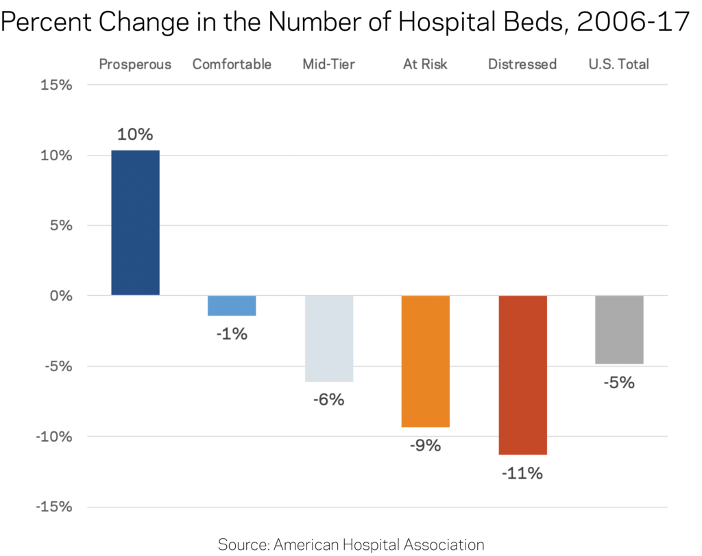
Rural areas bore the brunt of reductions in bed counts. Rural zip codes lost nearly one in five hospital beds to hospital closures or contractions between 2006 and 2017, shedding 34,200 of them in total. Over the same time, urban communities recorded only a 2 percent net reduction in the number of beds. In absolute terms, distressed rural areas alone lost 13,400 beds out of a nationwide decline of 47,200 beds, second only to distressed urban zip codes where beds remain plentiful.
After these gains and losses are taken into account, on a per capita resident basis distressed urban zip codes still contained by far the greatest density of hospital beds, and prosperous zip codes—both urban and rural—the lowest density among their respective peer groups.
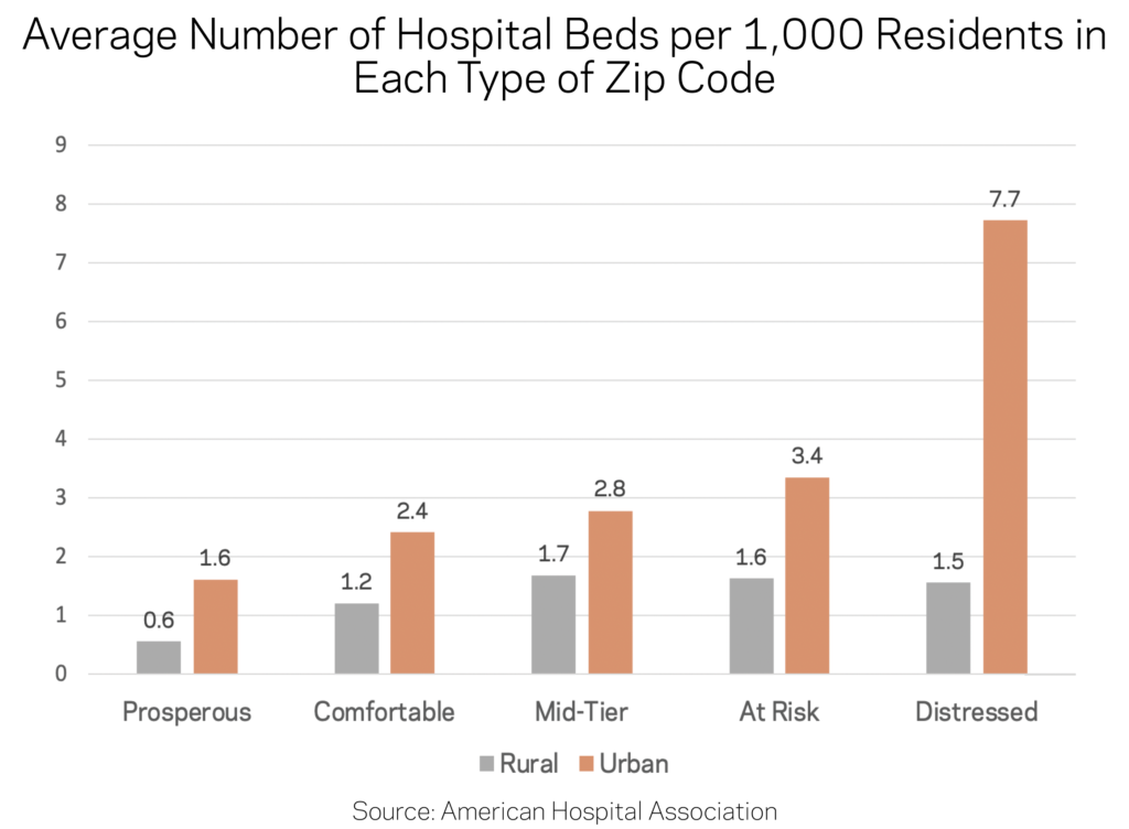
Residents of rural distressed zip codes have the worst hospital access. Of course, few people actually reside in the same zip code as their hospital. To ascertain practical access, defined as geographic proximity to hospital beds, we also examined the average number of hospital beds per 1,000 residents within 5 miles of an urban zip code or 20 miles of a rural zip code. In urban areas, residents of prosperous, comfortable, mid-tier, and at risk communities all had comparable access of around 40 beds per 1,000 residents. Residents of distressed urban zip codes had on average nearly double that figure: 80 beds per 1,000 residents.
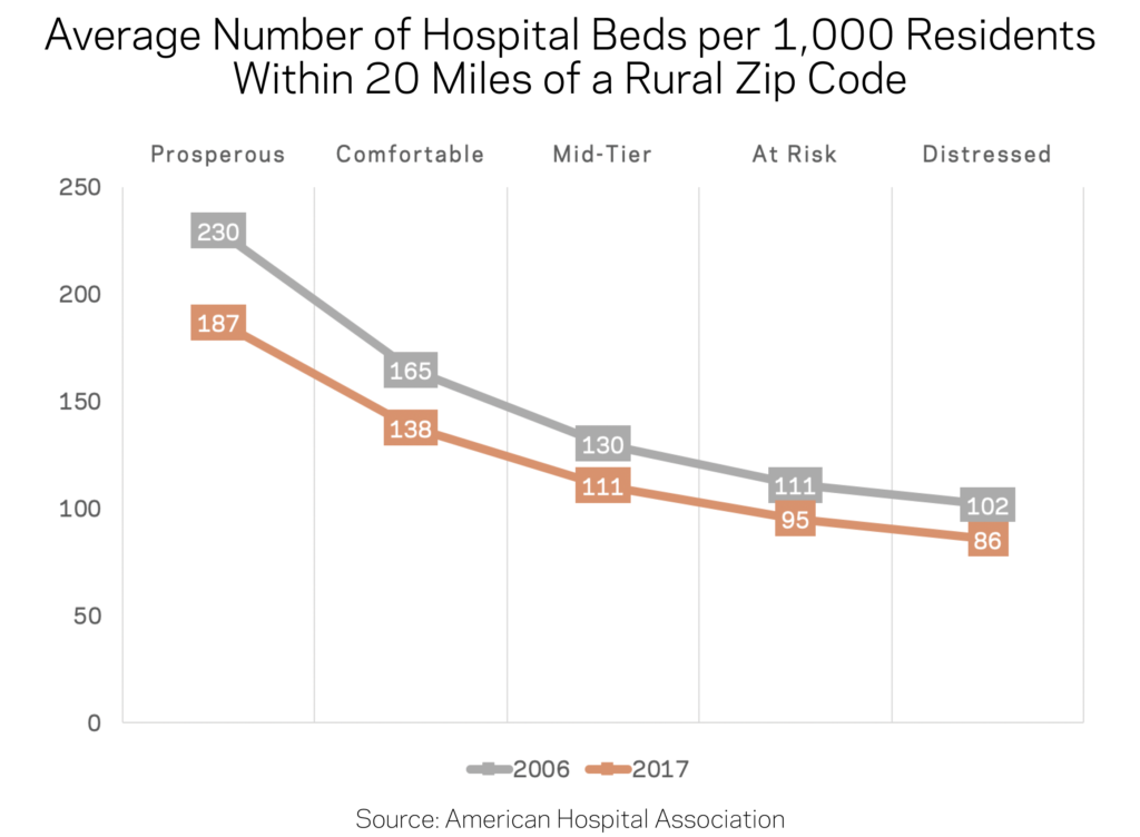
The picture changes more for rural zip codes. Looking within a 20-mile radius, prosperous rural zip codes actually enjoy the highest bed density of their peers. The situation facing residents of distressed rural zip codes, which are often more isolated and predominantly located in the south and interior west, is the exact inverse of their urban counterparts: they enjoy no disproportionate access to hospital beds and instead contend with the sparsest network. There are fewer than half as many hospital beds per capita reasonably accessible from the average rural distressed zip code as are from the average rural prosperous one. Regardless of its socioeconomic status, the typical rural zip code has fewer hospital beds within a 20 mile radius of its geographic center than a decade ago.
Discussion
This initial exploration of the geography of hospital systems relative to neighborhood-level social and economic well-being produces several surprising insights. First, residents of distressed urban zip codes do not appear to lack physical access to hospitals, although in practice insurance gaps and financial barriers may constrain their true ability to access the healthcare system proximate to them. In addition, the analysis finds that the sector is clearly consolidating by reducing its disproportionate footprint in struggling communities while expanding its relatively modest one in fast-growing prosperous communities. Accordingly, distressed rural zip codes are the likeliest of any group to be suffering from limited access. On that subject, researchers at the North Carolina Rural Health Research Program have done excellent work documenting the extent, causes, and impact of hospital closures on communities in the rural south in particular.
Subsequent research could build on this analysis in several ways. First, researchers could explore the trends in local markets, where changes to access from hospital closures, consolidations, or expansions may have greater impacts than what we observe at the national level. Second, hospitals could be differentiated based on the quality of care they provide or the breadth of services they offer, from mental health and substance abuse recovery to maternal care—all of which may vary geographically. Third, researchers could examine how market structure factors in (for example whether a local hospital market is competitive or dominated by a single player). And finally, as hospitals become increasingly important local economic engines, researchers could explore how local economic well-being changes in response to the growth or decline of major hospital systems.
Note: To inquire about accessing the data underlying EIG’s Distressed Communities Index, email [email protected]
Methodology Notes
Hospital locations and associated bed counts for the years 2006 and 2017 come from the American Hospital Association’s (AHA) Hospital Statistics dataset, downloaded August 26, 2019.
The AHA dataset was matched with the Economic Innovation Group’s (EIG) Distressed Communities Index (DCI) by Zip Code or Zip Code Tabulation Area, in order to match hospitals that have their own zip code with the communities in which they are located. The level of economic well-being associated with each zip code is based on its 2012-2016 DCI score; the best-performing quintile is considered “prosperous,” the second-best “comfortable,” the third “mid-tier,” the fourth “at risk,” and the fifth, or worst-performing, “distressed.”
Zip codes were characterized as “urban” or “rural” based on the classification used by the U.S. Health Resources and Services Administration’s Federal Office of Rural Health Policy.
To facilitate comparisons across geographies, EIG calculated a standardized number of beds per 1,000 residents for each zip code. Using GIS techniques, EIG also calculated the number of hospital beds within a 20 mile radius of each zip code’s geographic center (centroid), as made available by the National Bureau of Economic Research.
In order to calculate the change in population at the zip code level between 2006 and 2016, EIG created an estimated population for 2006 using figures from the 2000 and 2010 Decennial Censuses. EIG calculated the annual growth rate for each zip code between the two years and then applied the rate to the base population for 2000 to produce each zip code’s estimated population for 2006. The 2016 population figures come from the U.S. Census Bureau’s American Community Survey 5-Year Estimates for 2012-16, which are the same population figures used in the DCI.