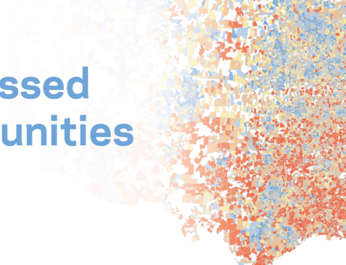
Thriving areas are poised to determine the 2018 midterms.
Amid all the polarization and prognostication of this political cycle, the midterms boil down to a simple question: can Republicans keep their coalition of some of the country’s most thriving areas alongside some of its most struggling intact?
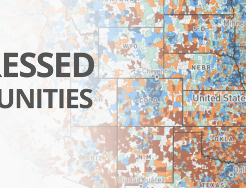
Far from the factory towns of the Rust Belt that captivated the punditry and helped determine the winner of the 2016 presidential election, the real battlegrounds of next week’s midterms are concentrated in congressional districts currently held by Republicans in faster-growing, more dynamic, and more diverse corners of the country. The balance of power in the 116th Congress runs through districts such as incumbent Congressman Will Hurd’s length of the Rio Grande, where 7 out of every 10 residents is Hispanic; or Carlos Curbelo’s vibrant corner of South Florida, in which nearly half of the population is foreign-born; or Barbara Comstock’s tech-fueled post in Northern Virginia, the wealthiest district in the country; or Kevin Yoder’s stable and prosperous heartland stretch of suburban Kansas City.
Of the 108 House races that the Cook Political Report classifies as competitive, only 14 are currently held by Democrats, placing Republicans on the clear defensive. From there only 69 races are very competitive (those classified as either leaning towards either party or complete toss-ups)–64 of which are currently held by Republicans. Nearly two-thirds of those very competitive Republican-held districts rank as prosperous or comfortable on EIG’s Distressed Communities Index (DCI), which combines the seven metrics from the table below into one holistic ranking out of 100. Seventy-percent of them fall in the top half of the distribution of overall economic well-being.
The average very competitive Republican-held district had a distress score of 34.8 on the DCI’s latest figures, released this month. That makes them better-off on average than the typical congressional district and much better-off than the average solidly Republican district, which scored more than 20 points worse. Reliably Republican districts look very different from contestable ones, in other words.
On the politically salient measure of business establishments, 55 percent of competitive districts Republicans are defending have fully recovered from the business closures of the recession based on the latest available data; for safe Republican seats, the figure is only 37 percent.
Performance of the average congressional district in select groups across the components of EIG’s Distressed Communities Index
Very competitive districts with Republican incumbents differ in other important ways too. They are far more diverse than solidly-Republican seats, and the average share of the population that is foreign-born is twice as high. Nearly 10 percent more of the adult population has a college degree. One out of every eight adults has an advanced degree, a higher proportion than nationally. The status quo has worked relatively well for most people in these districts. Immigration and globalization are likely to be woven into the fabric of community life. Stepping back, it seems that the 2018 election cycle may hinge on which party best speaks to future-focused constituencies in prospering, fast-growing, fast-diversifying corners of the country. The contrast with the 2016 election cycle couldn’t be starker.
Averages across key demographic indicators for select congressional districts
Above we used the Distressed Communities Index to explore the stark differences between safe and competitive GOP districts. Below we present a more complete survey of economic well-being across all districts nationwide. We hope you’ll join us in exploring the numbers both before and after the election as America chooses its next Congress.
A survey of the political and economic landscape before the 2018 midterms
The methodology developed to evaluate local economic well-being for the Distressed Communities Index can be applied to congressional as well. Doing so produces a rich portrait of the country’s political battlegrounds as we head into the November 2018 midterm elections. This comparative assessment of key political geographies doesn’t reveal a single overarching truth that clearly predicts the election’s outcome, however. Instead, the data paint a much more complicated and nuanced picture of the intersection of politics and economics, race and place, and culture and community. Below we present a survey of our findings, but among the top-line takeaways are:
- The average congressional district classified as competitive this election cycle by the Cook Political Report (n=108) is less distressed, higher income, faster growing, whiter, more educated, and home to fewer foreign-born residents than the average non-competitive district.
- The 31 true toss-up House races this election cycle are in districts that are on average significantly more diverse, immigrant-heavy, and educated than districts leaning towards either party. Most of these districts have fully recovered from the job losses of the recession too. In general they resemble solidly Democratic districts much more than they do solidly Republican ones.
- Republicans seem to be favored in comfortable, mid-tier, and at risk competitive districts, while Democrats seem to be running strongest in prosperous districts (which are most numerous among those up for grabs this election cycle) as well as distressed ones.
The national picture
Nationwide, the average Republican-held district was slightly better off than the average Democrat-held one, with distress scores of 49.5 and 50.8, respectively, on 2012-2016 data (scores closer to 100 are more distressed). The gap was wider during the 2007 to 2011 period, where the average Republican district scored 49.0 and the average Democratic one 51.5. (Explore EIG’s interactive maps at the district level here).
As the below figure shows, Republicans hold many more prosperous and at risk seats than Democrats, who for their part slightly edge out Republicans in the comfortable and distressed tiers despite holding 45 fewer seats overall. The Republican margin of power is clearly obtained by dominating two tiers of congressional districts–those that are very well off and those where well-being is most precarious. Remarkably, Republicans hold nearly twice as many at risk congressional districts as Democrats.
Number of districts held by each party at each level of economic well-being
Focusing in on the two extremes: The 10 most prosperous districts were evenly split between the two parties, while Democrats held six of the 10 most distressed. All of the 10 most prosperous districts could be found in the major metropolitan areas of the West, while the most distressed districts clustered in Appalachia, the South, and the urban Midwest. Six of the 10 most distressed districts were majority-minority.
10 most prosperous districts
10 most distressed districts
As the dominant party, Republicans currently represent more Americans in both prosperous and distressed zip codes—perhaps a more refined measure of community-level economic well-being—than Democrats do (although their margin in distressed zip codes is much smaller). In the end, Republicans represent 55 percent of the total population, 56 percent of the prosperous-community population, and 53 percent of the distressed population.
Party representation of Americans living in prosperous and distressed zip codes
Map of congressional districts by distress score (no partisan relationship to the color scheme)
Comparing the economic performance of the 115th Congress’ districts (to control for redistricting) between the 2007-2011 and 2012-2016 periods covered by the DCI, we find that seats currently held by Republicans were more likely to have risen or fallen on the index between the two periods than Democrat-held ones, reflecting the party’s rural base. (The main DCI report found that rural zip codes experienced much more volatility on the index over time than urban or suburban ones). In other words, economic well-being was more stable in seats presently held by Democrats between the two periods, relative to all other congressional districts, than for Republican ones, which saw economic well-being deteriorate in as many places as it improved.
Mobility of congressional districts among quintiles on the DCI (2007-2011 to 2012-2016)
Focus: competitive races
Only 108 of 435 district races, or a quarter of them, are actually considered competitive in the November midterm elections according to the Cook Political Report (we consider any district not categorized as “solidly” for either party by Cook as competitive). Only 14 out of the 108 are currently held by Democrats (13%). (Note that most of the discussion that follows will categorize districts by the party likely to win the seat, not the party currently holding it). Of the full 108 races, 27 percent are in districts in which well-being improved relative to peers from 2007-2011 to 2012-2016 while 30 percent are in districts whose position deteriorated.
DCI mobility breakdown of competitive districts
The average competitive district is less distressed, higher income, faster growing, whiter, more educated, and home to fewer foreign-born residents than the average non-competitive district. Competitive races have an average distress score of 38.5 compared to 50.4 for non-competitive ones. By extension, the balance of power in Congress is poised to be determined by voters who are significantly better-off than would be representative of the country as a whole.
Average distress scores across categories of competitive races
Congressional district map of Cook Political Report Categories (click through for legend)
Turning to demographics, districts that are solidly in Republican hands or leaning in that direction in November tend to have the highest non-Hispanic white shares of the population, while solidly Democratic races have the lowest. Interestingly, toss-up races have the second most diverse demographic composition on average. Solidly Democratic seats also have the highest average foreign-born share of the population, while solidly Republican ones have the lowest. Once again, the 31 true toss-up races have the second-highest share of foreign-born residents on average. Toss-up races are taking place in districts that look much more like solidly Democratic ones than they do solidly Republican ones.
Summary statistics by race category
DCI indicators (averages)
Demographic highlights (averages)
Turning to education, the 14 seats that are leaning Democratic have the highest average share of the adult population with at least a bachelor’s degree (41 percent). Again, true toss-up races have the next highest share, and solidly Republican ones the lowest.
Number of competitive congressional districts by quintile
An examination of how competitive races are distributed across quintiles reveals a number of interesting patterns. Republicans seem to be favored in comfortable, mid-tier, and at risk competitive districts (although a large number of mid-tier districts remain true toss-ups). Democrats seem to be running strongest in prosperous districts (which are most numerous among those up for grabs this election cycle) as well as distressed ones. Given how numerous prosperous districts are among competitive ones this election cycle, however, Republicans are poised to wrack up a number of wins in the quintile too.
Number of competitive congressional districts by quintile
Table: The 10 competitive districts that improved most on the DCI between 2007-2011 and 2012-2016
Table: The 10 competitive districts that deteriorated furthest on the DCI between 2007-2011 and 2012-2016
Most districts experienced slower job growth than the country as a whole from 2012 to 2016. Among Cook Political Report categories, only a majority of likely Republican districts were outperforming the country through 2016. Solidly Republican districts were least likely to match the national pace of job growth over the period.
The number of business establishments rose faster than nationally in 63 percent of districts that are leaning Republican, more than any other category. A slight majority of toss-ups also beat this benchmark, as did roughly half of lean and solid Democratic districts. The group of districts with by far the weakest rise in business establishments were likely Democratic seats mainly in the suburban Northeast. Only three of these 12 districts matched the national rate of increase in business places.
Share of districts experiencing faster job growth than the U.S. (2012-2016)
Share of districts experiencing faster establishment growth than the U.S. (2012-2016)
Seats that are leaning or likely Republican tend to have median incomes above the national average. Approximately 90 percent of likely Republican districts are relatively high income, compared to only about 20 percent of likely Democratic ones (and even less than that for solidly Republican ones, an interesting dynamic). Just over 50 percent of toss-up races are in districts with above-average median household incomes.
Share of districts with median income above national average (2012-2016)
Finally, comparing the full 2007 to 2016 period we can evaluate the extent to which competitive races are taking place in districts that have or have not fully recovered from the job losses and business closures of the Great Recession. On the jobs front, more than half of all districts in every category have fully recovered based on this measure, with the highest proportions among solidly Republican and toss-up districts (approximately 75 percent).
Far fewer districts have fully recovered to pre-recession levels of businesses, however. Only four categories passed the 50 percent mark: at least half of leaning Republican, leaning Democratic, solidly Democratic, or true toss-ups have reached this milestone, but only one-quarter of likely Democratic ones have. The fractured economic recovery may still loom large over the 2018 midterms.
Employment Recovery
Business Establishment Recovery