Originally published on Agglomerations, the Substack newsletter from the Economic Innovation Group.
By Sarah Eckhardt, Connor O’Brien, and Ben Glasner
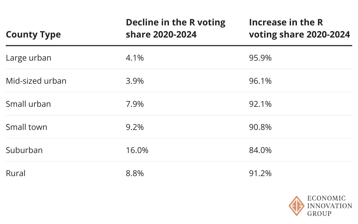
The geographic breadth of Donald Trump’s gains in the 2024 presidential elections was remarkable. Trump received a larger share of the vote, relative to his 2020 performance, in nine out of every 10 counties. And the shift in his direction was most common in the large urban counties that typically favor Democrats.[1]

Which economic and demographic variables were correlated with a rising vote share for Trump in a given county?
We already noted in a previous post that voters were most likely to move towards Trump in the most populous, most expensive counties. We also found, surprisingly, that inflation rates for housing and food were not at all correlated with the change in vote shares by county.
In this post we dig much deeper into the red shift and identify more of the factors associated with Trump’s gains in 2024. Here is what we found:
- A leading indicator for how far a county swung towards Trump is the size of its immigrant population share.
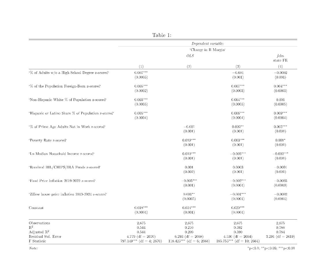
The higher a county’s share of immigrants, the more likely it was to shift votes towards Trump. We found that a county’s immigrant population share had one of the strongest correlations with a shift towards Trump of the demographic and economic factors we explored. (See the Appendix below for the full regression analysis.)
Queens County, New York is a good example. Nearly half (47.1 percent) of Queens residents are immigrants — and Trump received 10.4 percent more of the vote in Queens than he did in 2020, one of the biggest shifts among large urban counties.
Notably, this relationship does not extend to changes in a county’s immigrant population. When we looked at swings in the immigrant population share between 2016 and 2022,[2] we found a tiny negative correlation with voter shifts towards Trump (and thus a corresponding positive correlation with a shift towards Kamala Harris).[3]
- Trump gained the most in the least educated counties.
Political polarization across education groups is growing. The correlation between the share of a county’s population without a bachelor’s degree and the vote going to the Republican presidential candidate has been climbing ever since the 2012 election. And the opposite trend applies to the share of a county’s population with a college degree, which is correlated with Democrats gaining votes.
Non-college voters shifted towards Trump across all geographies, but Trump’s gains within this group were biggest in large urban counties.[4]
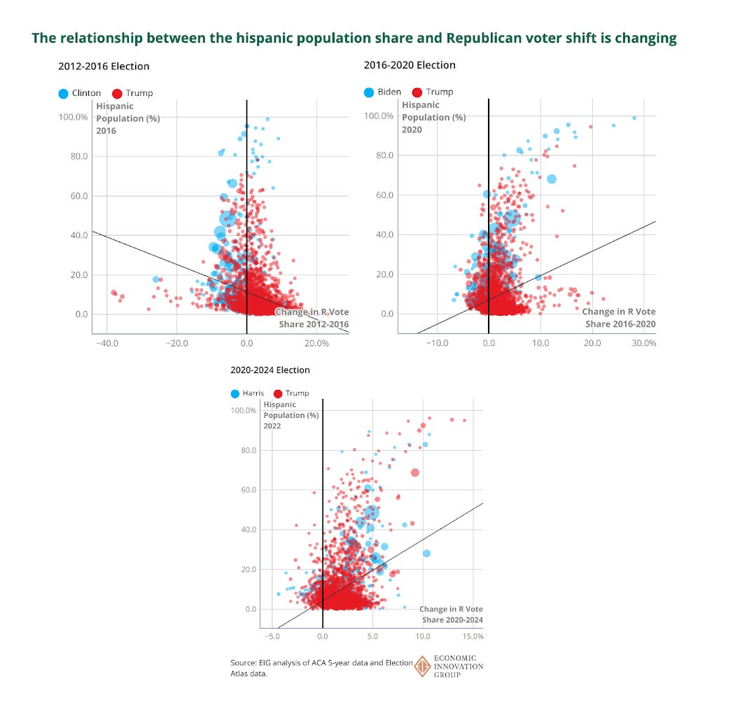
- The larger a county’s Hispanic share, the more likely Trump was to gain votes in the county.
In both 2020 and 2024, Trump gained votes in counties with large shares of Hispanic residents. This relationship was strongest in large urban counties and in counties on the southern border.
The largest shift in the Trump voting share — of any county across the entire United States — took place in Maverick County, Texas, which swung towards Trump by 14.1 percentage points. Roughly 19 out of every 20 Maverick residents are Hispanic.
This trend is a reversal from the results of the 2016 election, when higher shares of voters in counties with large Hispanic populations turned out for Hillary Clinton in 2016 than they had for Barack Obama in 2012.

- Trump gained more in counties that are in economic distress.
Following historical precedent, counties that are relatively worse off in terms of unemployment, poverty, and median household income were more likely to choose the non-incumbent candidate, Trump in this case.[5]
The figure below splits counties into five quintiles, according to the gains and losses in the Trump vote share. Counties in Quintile 5 had the highest increase in the share of votes going to Trump between 2020 and 2024, and counties in Quintile 1 had the lowest.[6]
The relationship is again clear — the more a county has been suffering economic distress, the bigger its voting shift to Trump. (We measure indicators of distress using our Distressed Communities Index.) For counties in the highest quintile, the average poverty rate was 5 percentage points higher than for counties in the lowest quintile, prime-age adults were 6 percentage points more likely not to be employed, and a much smaller share of residents lived inside prosperous zip codes.
- Place-based federal spending did not help Harris.
Democrats may have hoped that high-profile federal investments in local communities over the past few years would sway voters in their direction. There is no evidence that this spending had an impact on the election results. At the county level, we found no relationship between voting shifts to Trump at the county level and spending per capita on projects from the Bipartisan Infrastructure Law, CHIPS and Science Act, or Inflation Reduction Act.
- Counties with a high dependence on transfer income favor Trump.
Places that rely more on government transfers tended to vote for Trump, while less reliant places tended to vote for Harris. (Transfers include programs like Social Security, Medicare, Medicaid, Unemployment Insurance, and the Earned Income Tax Credit.)
Earlier this year we published The Great Transfer-mation, an analysis about the growing reliance of American communities on government transfers. We found that as of 2022, 18 percent of total personal income in the United States came from government transfers.
Trump received 63 percent of the vote among significantly reliant counties, whose residents receive at least a quarter of their personal income from transfers. Harris received 56 percent of the vote among minimally reliant counties, where less than 15 percent of total personal income is from transfers.
——————————————————————————
APPENDIX
To explore the relative importance of economic and demographic factors, we estimated a series of regression models: with demographic characteristics only, economic characteristics only, economic and demographic characteristics combined, and economic and demographic characteristics with state fixed effects. All independent variables are z-scored, and population weights are applied. It is clear that the low-educated population share, the foreign-born population share, and the Hispanic population share, poverty, and unemployment are the most strongly associated with how far a county swung right, though the relative importance of these variables depends on the model specification.

Notes
- The data is updated as of Tuesday, November 12, 2024. We exclude counties for which voter turnout was <80 percent that of the 2020 election.[↩]
- The most recently available data goes through 2022.[↩]
- This correlation is -0.04.[↩]
- The correlation coefficient between the share of a county’s population without a high school degree and Trump’s gain in the vote share is In large urban counties this was 0.76 for large urban counties, and 0.39 for rural counties.[↩]
- Benedictis-Kessner, Justin De, and Christopher Warshaw(2020) Accountability for the Local Economy at All Levels of Government in United States Elections, American Political Science Review[↩]
- Counties that shifted towards Harris (away from Trump) were also included in the rankings. They are part of Quintile 1.[↩]


